What Might Have Been
Take a trip behind the scenes and explore a radical early concept of Wrapmate's Transformers-themed Civic Type R.
I assume you've seen the Transformers-themed Civic Type R we wrapped over at Wrapmate. If not, allow me to refresh your memory:
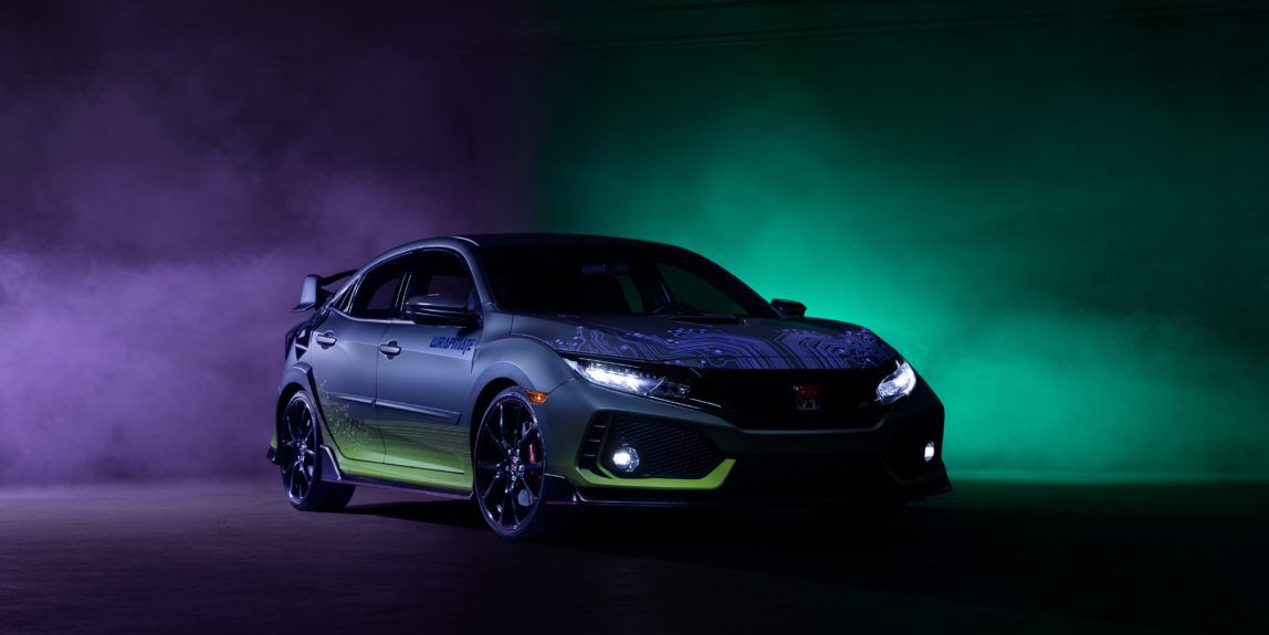
How did this design come to fruition? I worked with one of our designers, Travis, who absolutely knocked this custom wrap out of the park. He and I are both a product of growing up in the 80s, so relating to the classic Hasbro toy was an unspoken bond we shared. Fond childhood memories felt ripe to tap into.
I've always been partial to the bad guys, whether it be the Decepticons in Transformers, the Horde in World of Warcraft, or House Slytherin in Harry Potter. And, when reflecting on all the time spent playing with Transformers, the toy that stood out the most was Devastator, the combined forces of the Constructicons.
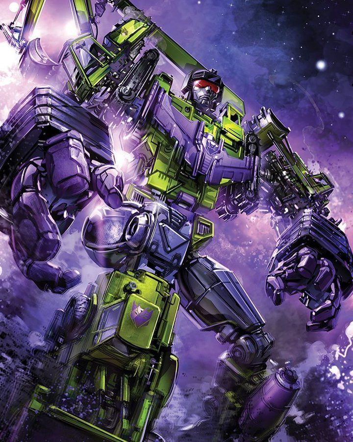
I don't know what it was about the Constructicons that forever burned themselves into my brain, back in 1985, but it was likely a combination of:
- Devastator being featured in they very first comic I ever bought (issue #10),
- the marketing genius of enticing kids to collect multiple toys in a set before being considered complete, which kicked off a personality trait that is with me today, or...
- that bizarre, unique palette that combined fluorescent green and deep purple.
It was that last bullet that Travis and I locked in early. No matter what design we ended up with, it needed to hew to the Constructicons' color palette.
So, what's that color palette look like in real life?
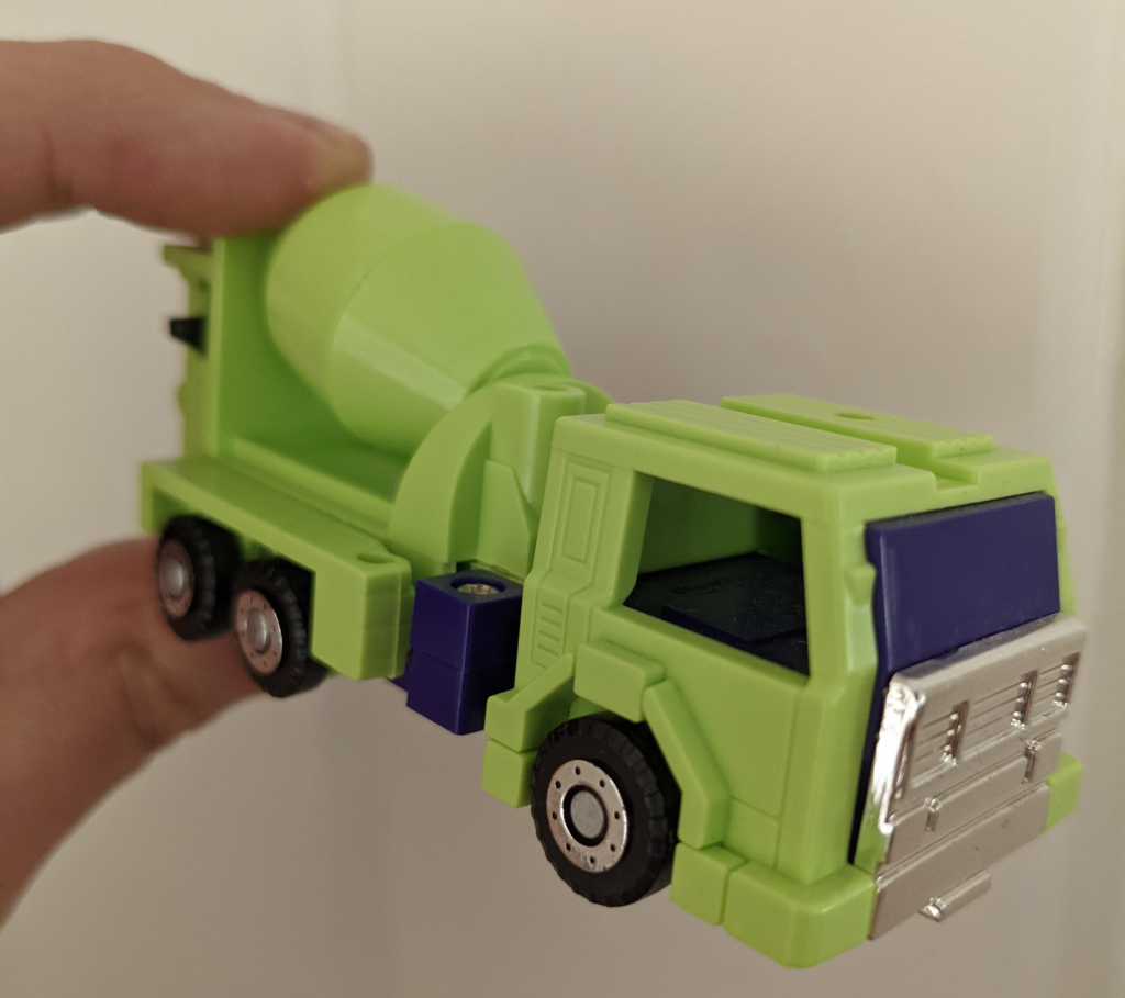
I think you'd agree: bright fluorescent green, deep purple, black, and silver were quite...eccentric, to say the least.
With the palette decided, the next question focused on strategy. If the vinyl wrap were designed as a tribute to the toy, did that mean making the Type R look as if it were a toy itself? If so, how might that look? Should there be a consideration for decals that the toys famously had us apply as kids? And what of the purple opaque windows? Certainly, that was not going to be an option on a vehicle that needs standard visibility to be road safe.
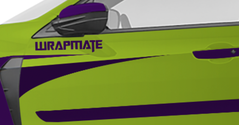
In taking all of that into consideration, I have to commend Travis for his ability to transform that childhood vision into reality:
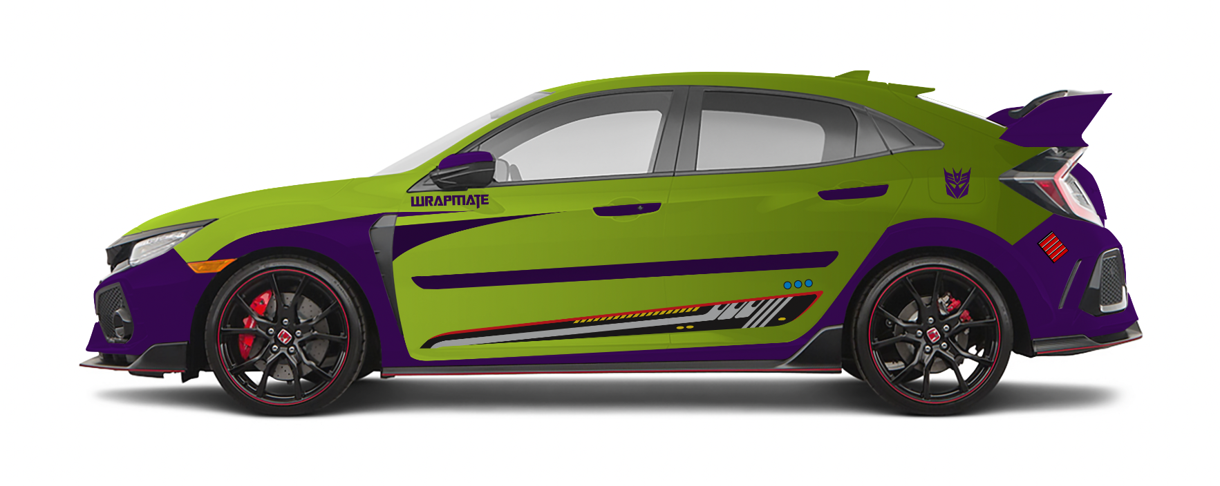
Everyone on the team thought this was pretty bad-ass. It would definitely turn heads (which is what we wanted!) Travis' first design even incorporated those decals we talked about, which would have implemented via a specialized reflective film that behaved just like the stickers on the original toy – shine a light into them and they would blast back, just like a mirror. As for the problem of opaque purple windows, Travis moved the purple to portions of the body frame that followed the Type R's natural cut lines, maintaining the homage while accentuating the feel of a toy brought to life.
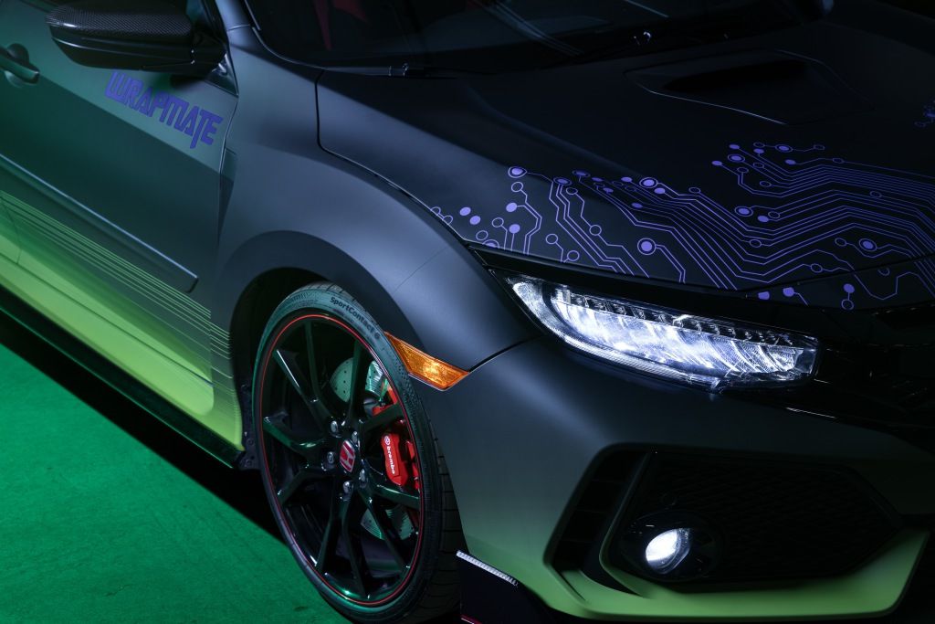
I especially appreciated the attention to detail Travis revealed with the Transformers typeface used to display the Wrapmate logo, just below the rearview mirrors, as opposed to sticking with our brand font.
And yet...I felt like this may have been a little too audacious. As cool as this was, there was definitely a degree of corniness about it as well. Travis and I talked about this and decided that we didn't want to come up with a design that some people would think is cool (as part of an inside joke), while many others wouldn't get at all...and just see it as bizarre or (gulp!) childish.
We wanted everyone to think it was cool.
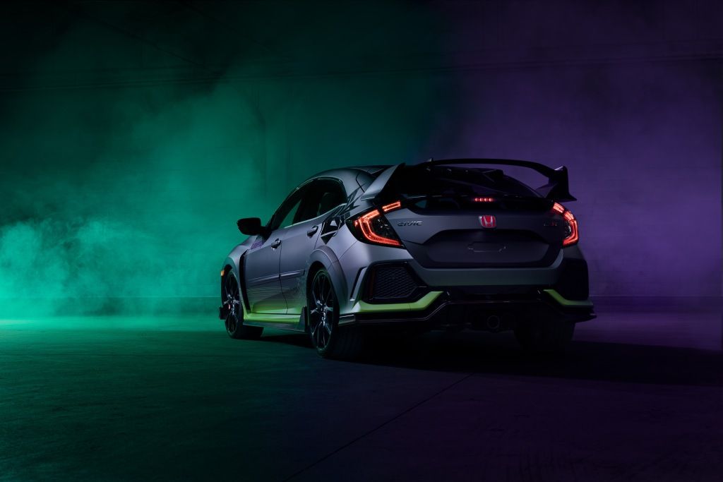
So, for round 2, we simply asked "what if the color palette was repurposed for a tricked out racing team in a Fast and Furious movie?"
That is what led to round 2:
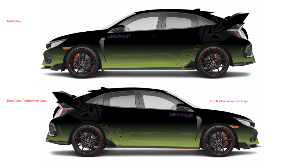
Now, we're getting somewhere!
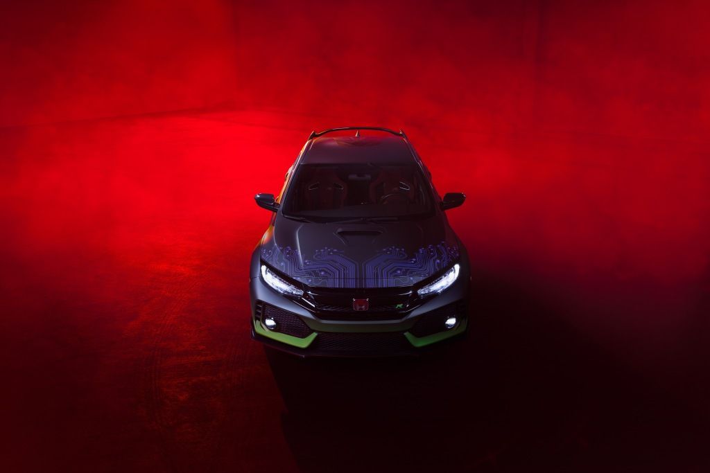
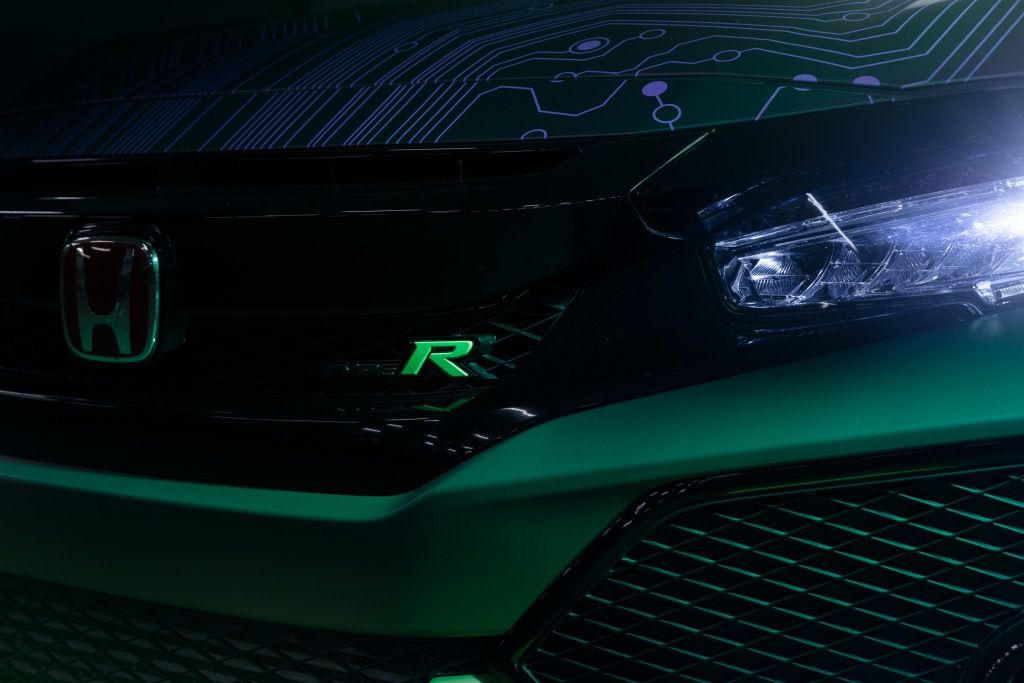
This version shifted the fluorescent green from the primary color of the design to a gradient transition along the base of the vehicle, accented with circuitry to convey that robots, may in fact, be in disguise. Meanwhile, the Wrapmate logo remained (slightly enlarged), while the Decepticon logo was rotated 45 degrees, and moved to rear of the vehicle. It, like the Wrapmate logo, was also specified to leverage reflective film.
Additionally, purple circuitry was added to the hood. It, along with the Wrapmate logo, maintained the initial goal of sticking to the Constructicons' green/purple palette.
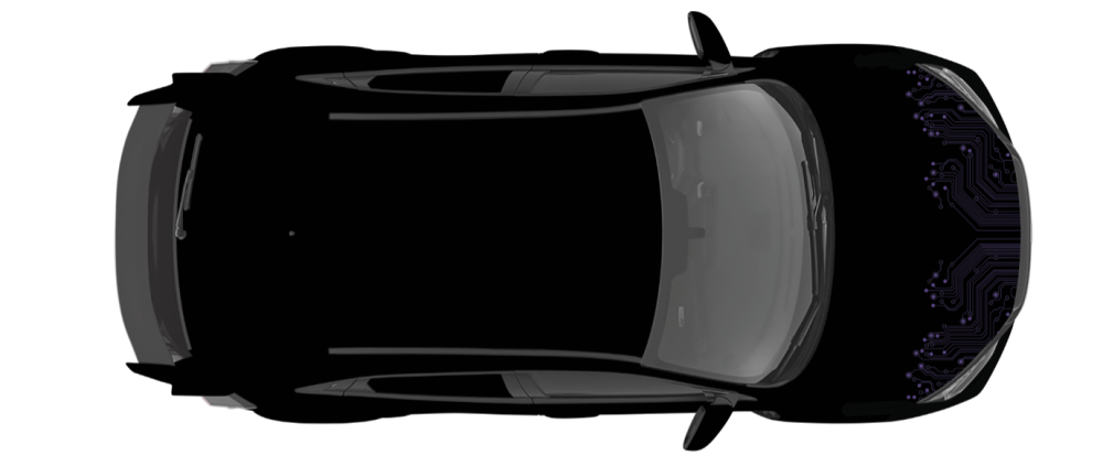
After seeing this design, there was no turning back. The rest, they say, is history. So, what do you think? Do you think we made the right decision? The original concept was pretty awesome, in retrospect...
...but the final design is definitely not one to toy with.
